7 tricks for beautiful plots with Mathematica
Why are the simple things so non-intuitive?

I love Mathematica notebooks, for analytical calculations, prototyping algorithms, and most of all: plotting and analyzing data.
Importing and plotting some data is easy enough:
SetDirectory[NotebookDirectory[]];
data = Import["my\_data\_file.txt", "Table"];
ListLinePlot[data]
But setting the options right on those plots is confusing. What are the default colors? How do you adjust the font sizes? The legend? The legend sizes? Color functions? Exporting the plot with correct resolution? Getting the layout of the plots to come out right? Scaling multiple plot ranges?
Let’s get into it.
-
What are the default colors?
I use the “scientific” plot theme in Mathematica. Often, I want to manually set the colors in a plot. But how do you get those colors? The confusing command to get them is:
colors = (("DefaultPlotStyle" /. (Method /.
       Charting`ResolvePlotTheme["Scientific", ListLinePlot])) /.
   Directive[x\_, \_\_] :> x);

Even crazier: if you don’t use the “scientific” theme, the default colors are:
colors = Table[ColorData[97][i], {i, 1, 15}]

I mean, seriously? ColorData[97] is the default?
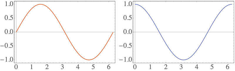
2. Base style in plots
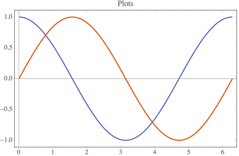
The default font sizes in plots are way too small:
plt = Plot[{Sin[x], Cos[x]}, {x, 0, 2*Pi}, PlotLabel -> "Plots"]
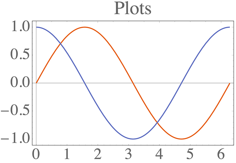
It’s possible to set individual sizes for each axis and the label, but it’s easier to use BaseStyle to adjust it everywhere:
plt = Plot[{Sin[x], Cos[x]}, {x, 0, 2*Pi}, PlotLabel -> "Plots", BaseStyle -> {FontSize -> 24}]
-
Color functions and scaling
Let’s see how a plot legend looks.
colors = (("DefaultPlotStyle" /. (Method /.
        Charting`ResolvePlotTheme["Scientific", ListLinePlot])) /.
    Directive[x\_, \_\_] :> x);
leg = LineLegend[colors[[;; 2]], {"Sin", "Cos"}];
p1 = Plot[{Sin[x], Cos[x]}, {x, 0, 2*Pi}, PlotLegends -> leg]
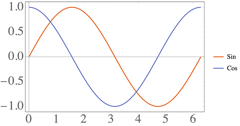
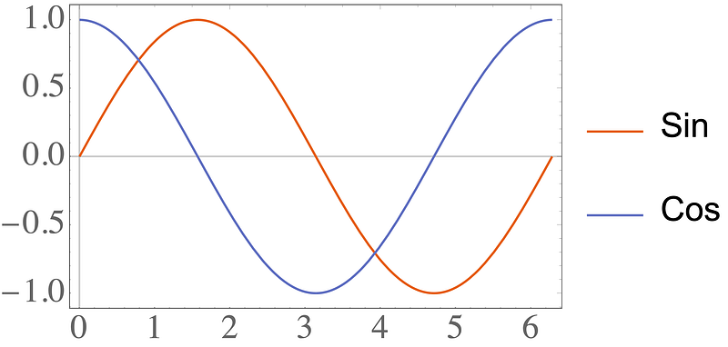
To set the legend size for the font, we need to use the very confusing: LabelStyle -> Directive[FontSize -> 24] . To make the lines next to the text larger, we can use: LegendMarkerSize -> 40 .
colors = (("DefaultPlotStyle" /. (Method /.
        Charting`ResolvePlotTheme["Scientific", ListLinePlot])) /.
    Directive[x\_, \_\_] :> x);
leg = LineLegend[colors[[;; 2]], {"Sin", "Cos"},
   LabelStyle -> Directive[FontSize -> 24], LegendMarkerSize -> 40];
p2 = Plot[{Sin[x], Cos[x]}, {x, 0, 2*Pi}, PlotLegends -> leg,
  ImageSize -> 400]
-
Color functions and scaling
Things get even more confusing when we go to color functions. Let’s make a matrix which has all elements in [0,1], except for the 1,1 element which is 10000 .
m = RandomReal[{0, 1}, {10, 10}];
m[[1, 1]] = 10000;
Plotting the matrix gives:
pltM1 = MatrixPlot[m, PlotLegends -> Automatic]
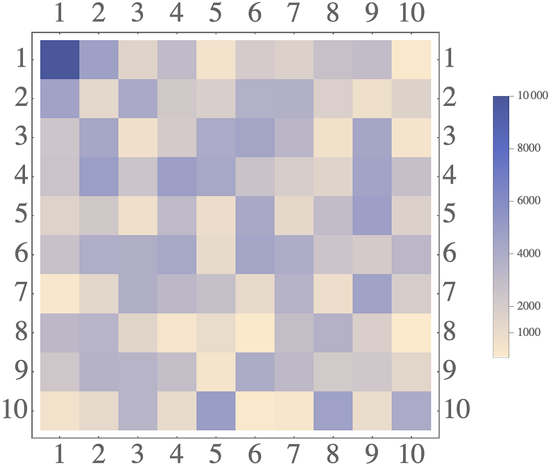
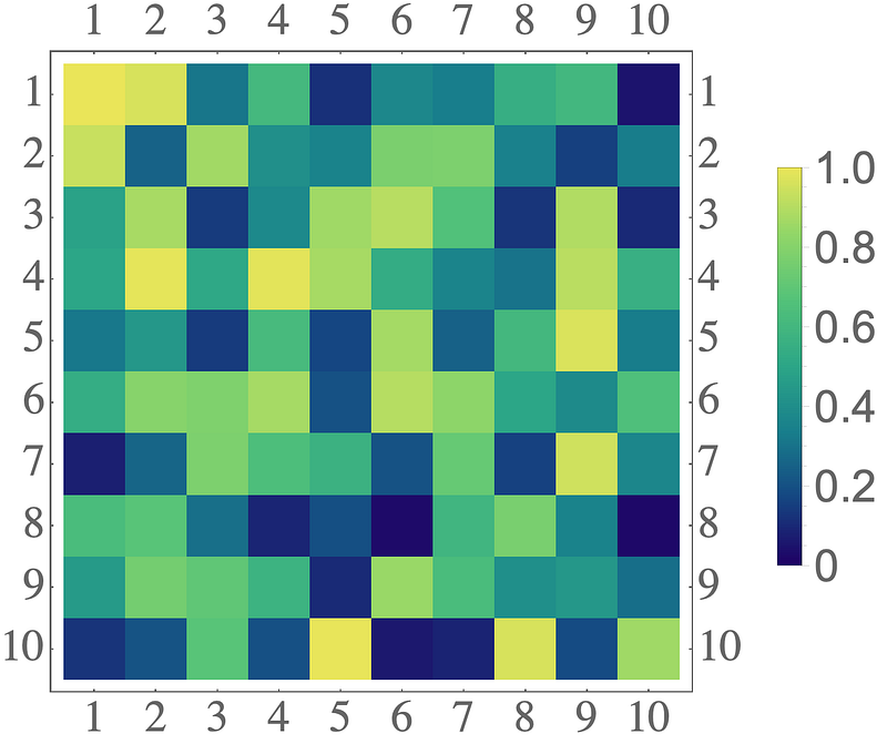
The legend here is totally wrong. Most elements are in [0,1] , so the legend must also be in [0,1] . Confusingly, adding PlotRange->All does nothing!
pltM2 = MatrixPlot[m, PlotRange -> All, PlotLegends -> Automatic]
Ugh. The correct fix is to create the legend manually:
leg = BarLegend[{"BlueGreenYellow", {0, 1}},
   LabelStyle -> Directive[FontSize -> 24]];
But that’s not enough! You also need to change the color scaling on the plot:
leg = BarLegend[{"BlueGreenYellow", {0, 1}},
   LabelStyle -> Directive[FontSize -> 24]];
pltM3 = MatrixPlot[m, PlotRange -> All, PlotLegends -> leg,
  ColorFunction -> (ColorData[{"BlueGreenYellow", {0, 1}}]),
  ColorFunctionScaling -> False]
-
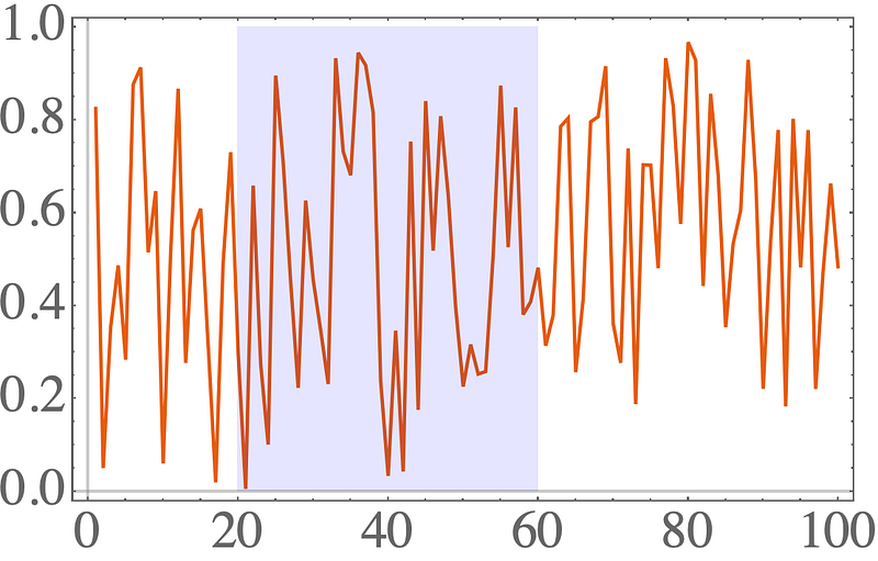
Exporting figures
Let’s take a break with something a little less confusing: exporting figures.
plt = ListLinePlot[RandomReal[{0, 1}, 100]]
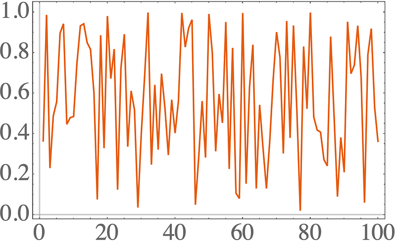
The standard command is:
SetDirectory[NotebookDirectory[]];
Export["plt.pdf", plt];
You just sort of specify the type of the file via the extension, and it just sort of works…. Even better: if you don’t set the directory to the notebook directory, the file will just end up somewhere totally different from the local directory.
For many formats, you will also have to specify the image resolution:
Export["plt.png", plt, ImageResolution -> 200]
-
Always use Grid
There are three main commands to tile plots: Row, Column, Grid . This sounds like they make a row of plots, a column of plots, or a 2D grid of plots, right? Let’s try it out:
colors = (("DefaultPlotStyle" /. (Method /.
        Charting`ResolvePlotTheme["Scientific", ListLinePlot])) /.
    Directive[x\_, \_\_] :> x);
plt1 = Plot[Sin[x], {x, 0, 2*Pi}];
plt2 = Plot[Cos[x], {x, 0, 2*Pi}, PlotStyle -> colors[[2]]];
pltRow = Row[{plt1, plt2}]
So far so good, but let’s export it:
SetDirectory[NotebookDirectory[]];
Export["plt\_row.png", pltRow, ImageResolution -> 200];
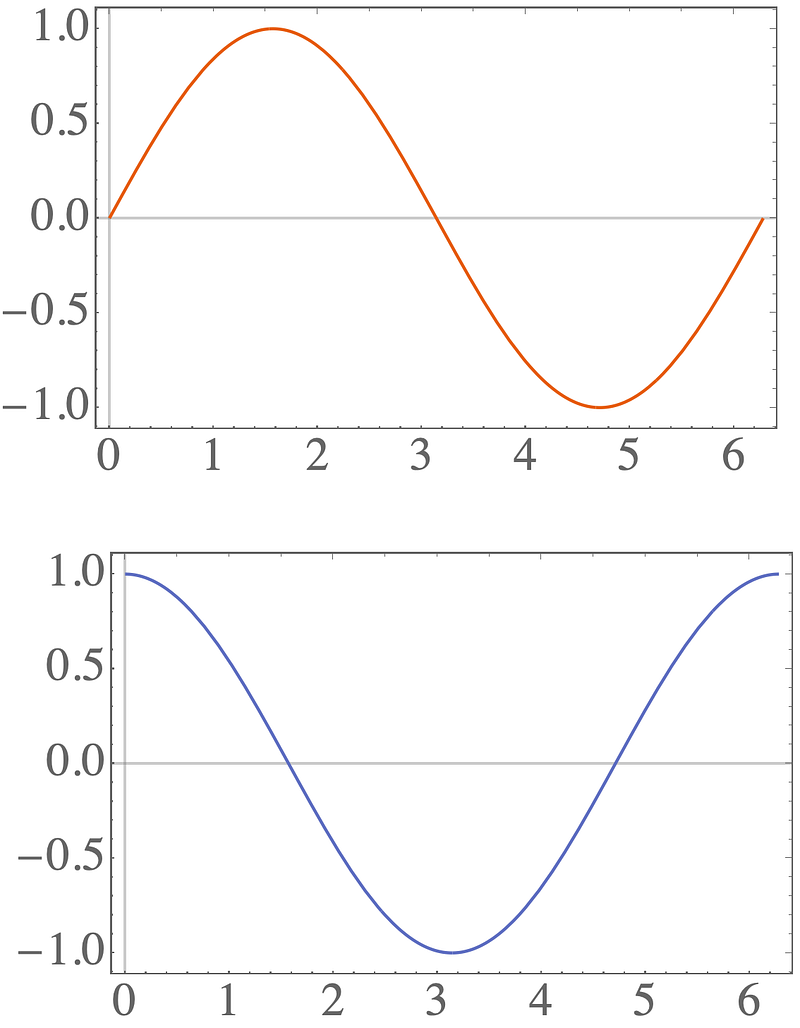
What happened?! How did a row of plots turn into a column?
The solution is to always use a Grid :
pltGrid = Grid[{{plt1, plt2}}]
which gives when exporting:
-
Plot ranges with Show
You can combine all sorts of graphics objects with the Show command:
p1 = ListLinePlot[RandomReal[{0, 1}, 100]];
p2 = Graphics[{Blue, Opacity[0.1], Rectangle[{20, 0}, {60, 1}]}];
pShow = Show[p1, p2]
This looks nice and simple, but the ranges of the plots get’s pretty crazy:
p1 = Plot[Sin[x/5], {x, 0, 100}];
data = RandomReal[{-1, 1}, 100];
data[[95 ;;]] += 100;
p2 = ListLinePlot[data, PlotStyle -> {Blue, Dashed}];
pShow = Show[p1, p2]
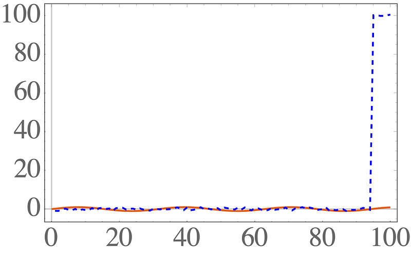
The first plot goes from [-1,1] . The second one goes from [-1,100] .
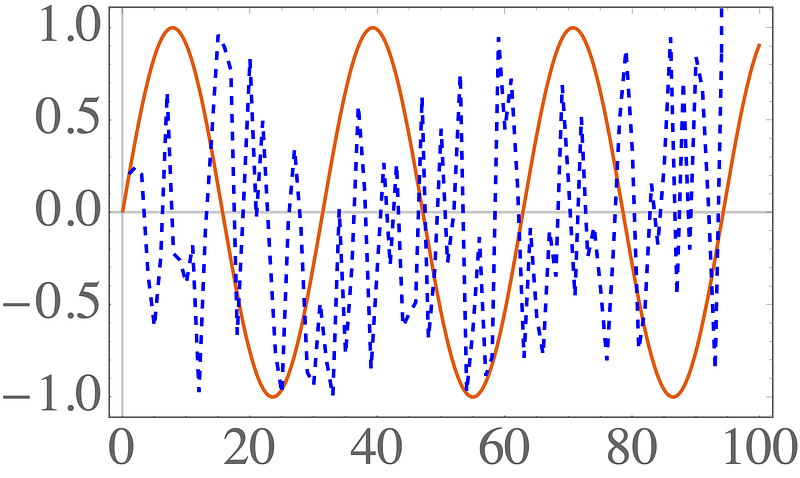
This didn’t work — it defaults to the range of the first plot passed to Show . Let’s add PlotRange->All to the Show command.
p1 = Plot[Sin[x/5], {x, 0, 100}];
data = RandomReal[{-1, 1}, 100];
data[[95 ;;]] += 100;
p2 = ListLinePlot[data, PlotStyle -> {Blue, Dashed}];
pShow = Show[p1, p2, PlotRange -> All]
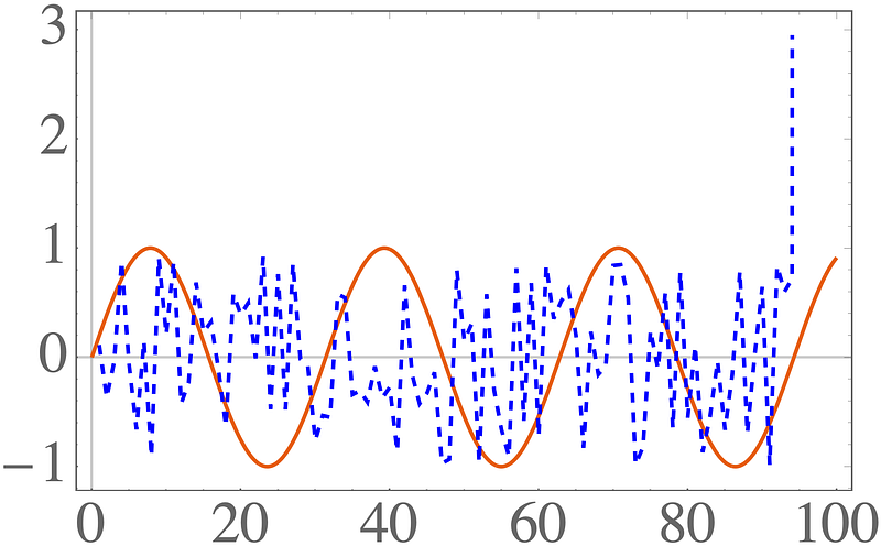
That still didn’t work! The default scaling for the second plot cuts off the final points. You need to add PlotRange->All to both Show and the Plot commands!
p1 = Plot[Sin[x/5], {x, 0, 100}];
data = RandomReal[{-1, 1}, 100];
data[[95 ;;]] += 100;
p2 = ListLinePlot[data, PlotStyle -> {Blue, Dashed}, PlotRange -> All];
pShow = Show[p1, p2, PlotRange -> All]
Finally, correct scales everywhere!
Final thoughts
Mathematica has lot’s of nice plotting options, but so many of the basics are so confusing. I hope these tips filled in some of the gaps.
Contents
Oliver K. Ernst
July 15, 2020